BRAND IDENTITY, ILLUSTRATION BULL RUN COLLECTIVE WORKS WITH THE LOCAL FOOD & BEVERAGE COMMUNITY OF NYC— THE PERSONALITIES, PRODUCTS, & PLACES THAT WANT TO CONNECT MORE WITH THEIR ONLINE AUDIENCE.
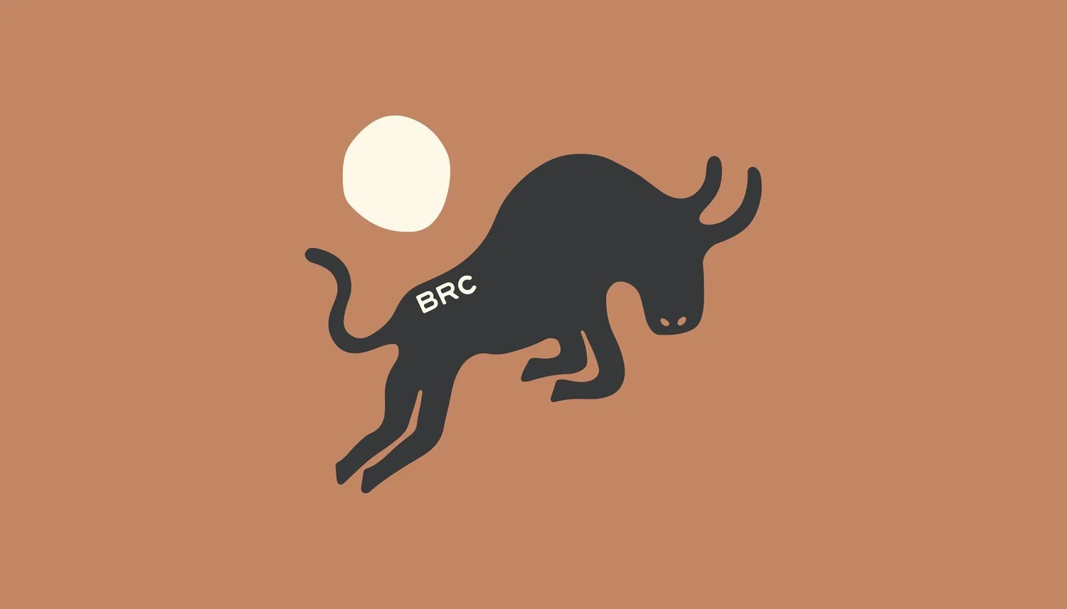
ROOTSIt began with a bull, symbolising the founder's father and sister, & their inherent strength. The bull evolved beyond representing her family to embodying her business. We used this as the foundation for the brand identity.
APPROACHBulls, known for their inherent strength, fierceness, and aggression, took on a soft, almost graceful feel in my conceptualization. The image of a cow jumping over the moon came unexpectedly to mind, a connection that only dawned on me as I reflected on this process. The colors and typography chosen evoke a sense of 'the West,' offering a unique juxtaposition for this city-centered business.