BRAND REFRESH, WEB DESIGN, ART DIRECTION, ILLUSTRATION, COPYMINBIE, AN AUSSIE-BASED BABY BOTTLE COMPANY, SETS ITSELF APART WITH A UNIQUELY PATENTED NIPPLE DESIGN WHICH ENSURES THE BABY’S ABILITY TO GO FROM BREAST- TO BOTTLE WITH EASE.
CHALLENGEMinbie positioned itself in the Australian bottle industry as a key brand with it's unique patent, the company also had a massive social following among mums, but the website had some short-coming and never had a user-centered designer approach.
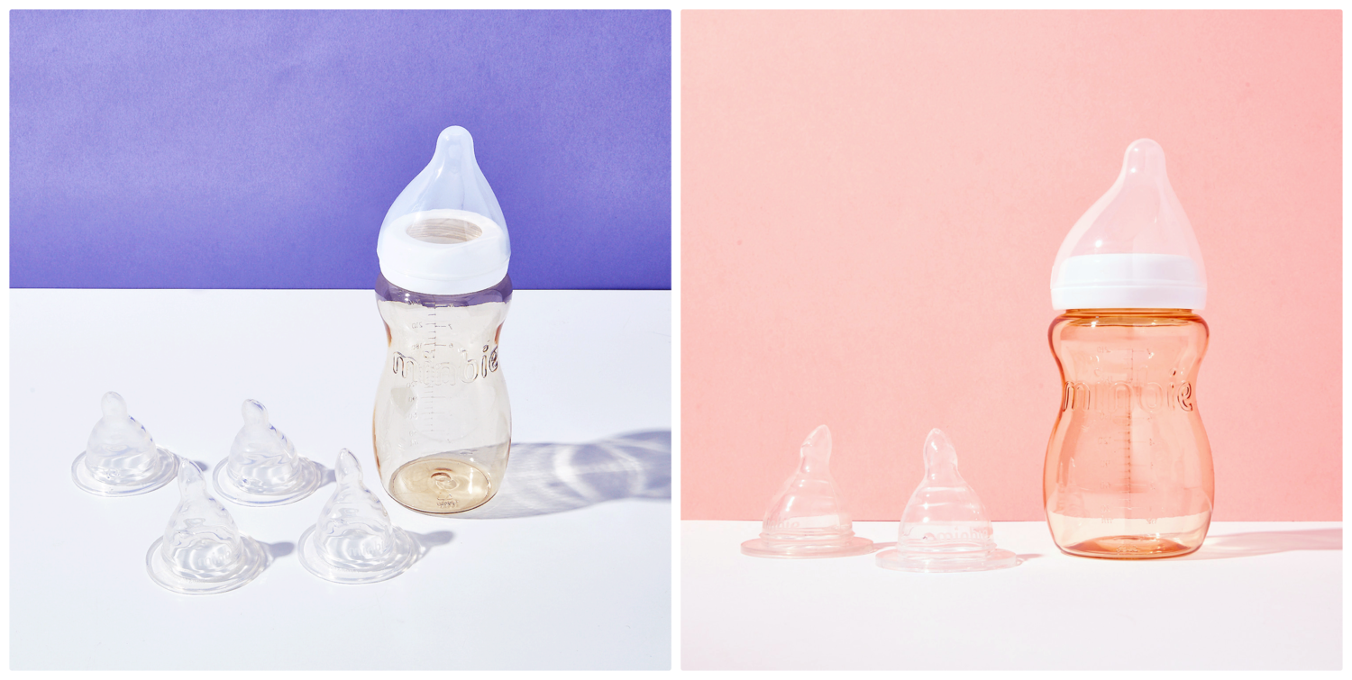
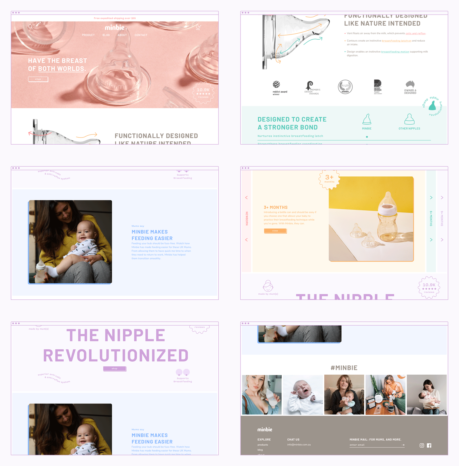
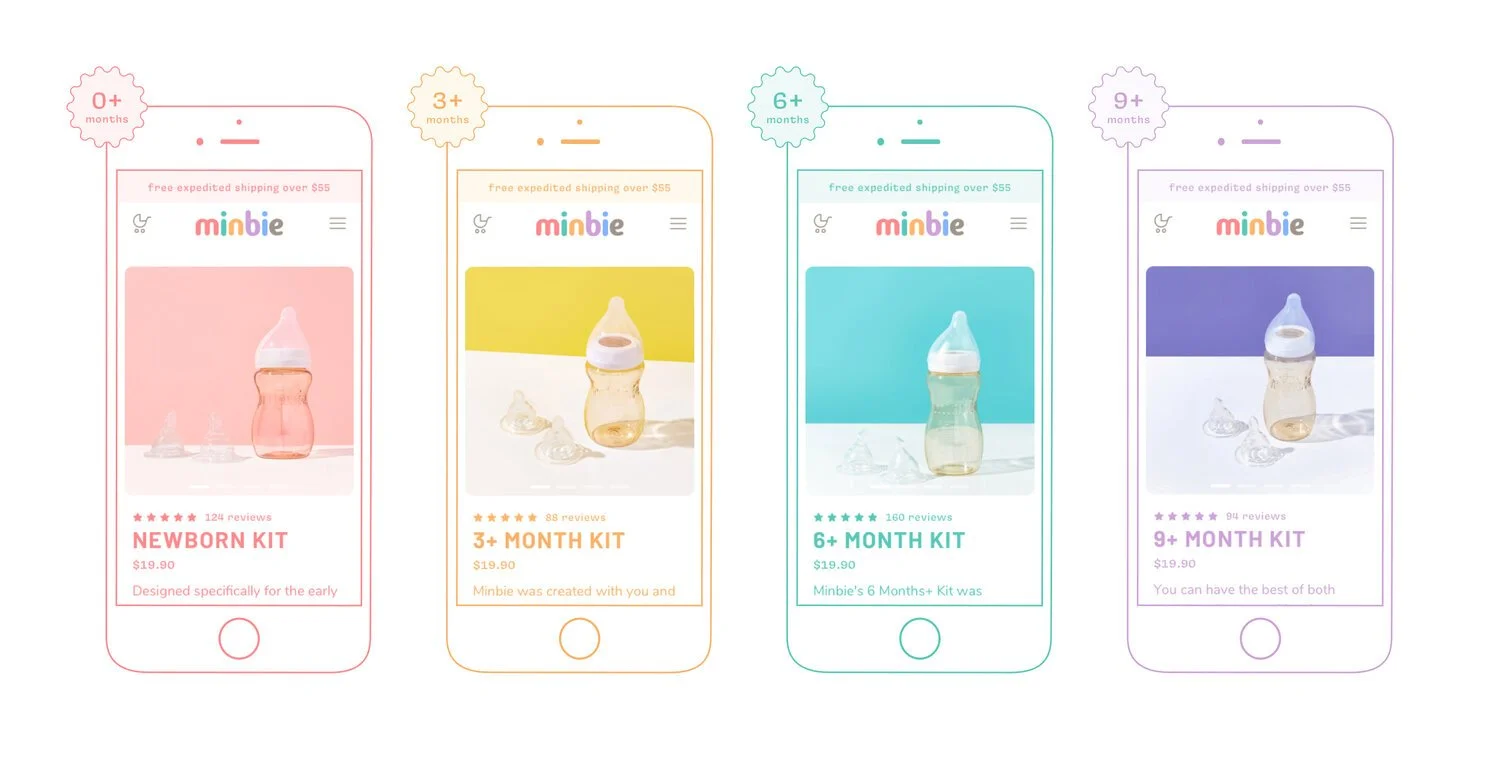
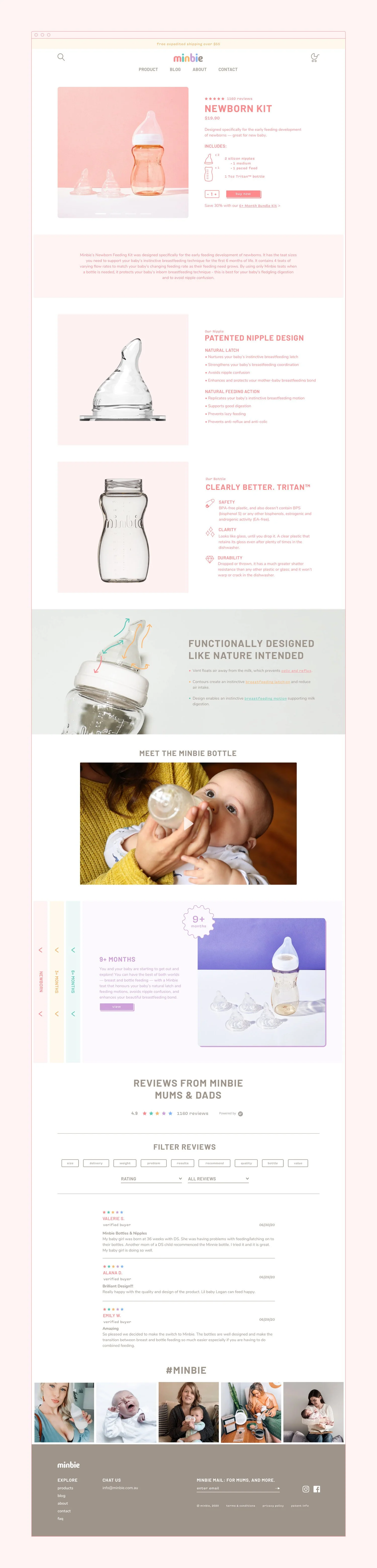
APPROACHThe goal with minbie was to create a space in which mums can learn about the product that resonates with them on a human level whilst being fun & playful. The colour palette was amped up from muted towns to brighter versions, a typographic system was chosen, , and illustrations created that would tie-in with the adolescent qualities of the logo. Yet, the main goal of the site redesign was to incorporate the previous infographics and information in a new way making them more digestible and easier to comprehend.