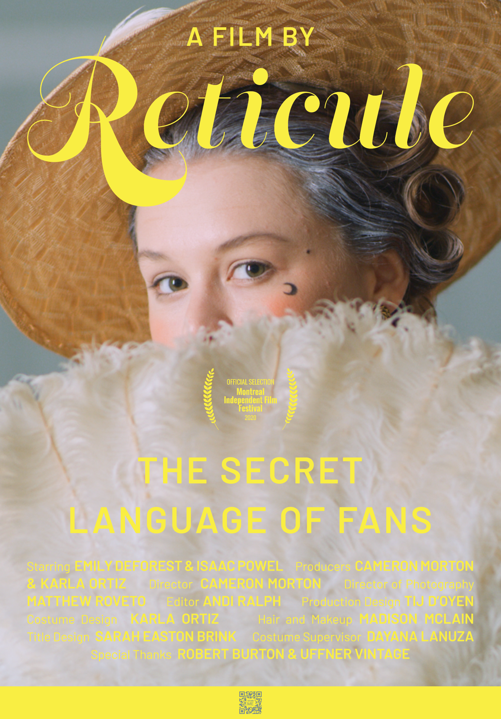
BRAND IDENTITY, TITLE DESIGN, PRINT, SOCIAL, COPYRETICULE, A SERIES OF EXPOSÉS ON THE HISTORY OF THE FORGOTTEN PREMIERS WITH A PLAYFUL FIRST EPISODE ON THE SECRET LANGUAGE OF FANS.
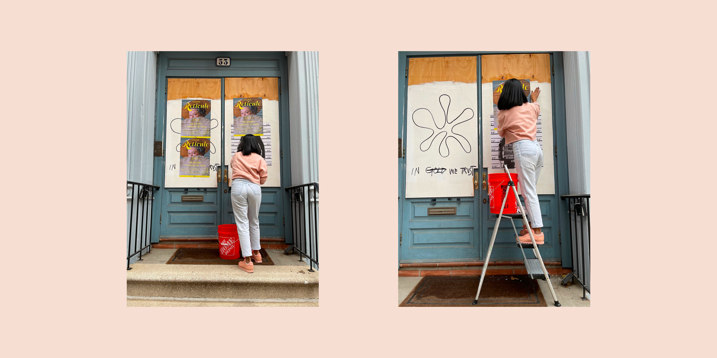
CHALLENGEA modernised-period-piece-silent-short needed title design, so viewers could understand the secret language of the handheld fan. But it was more than just a film—it represented the debut of an emerging film production house, in need of an identity. With Film Festival premieres quickly approaching, we needed to create an identity, film posters, & ¡hype!
APPROACHLed by a female costume designer with a penchant for the Victorian era and the visual aesthetics of the first episode inspired the title design and also paved the way for the production house's broader identity.