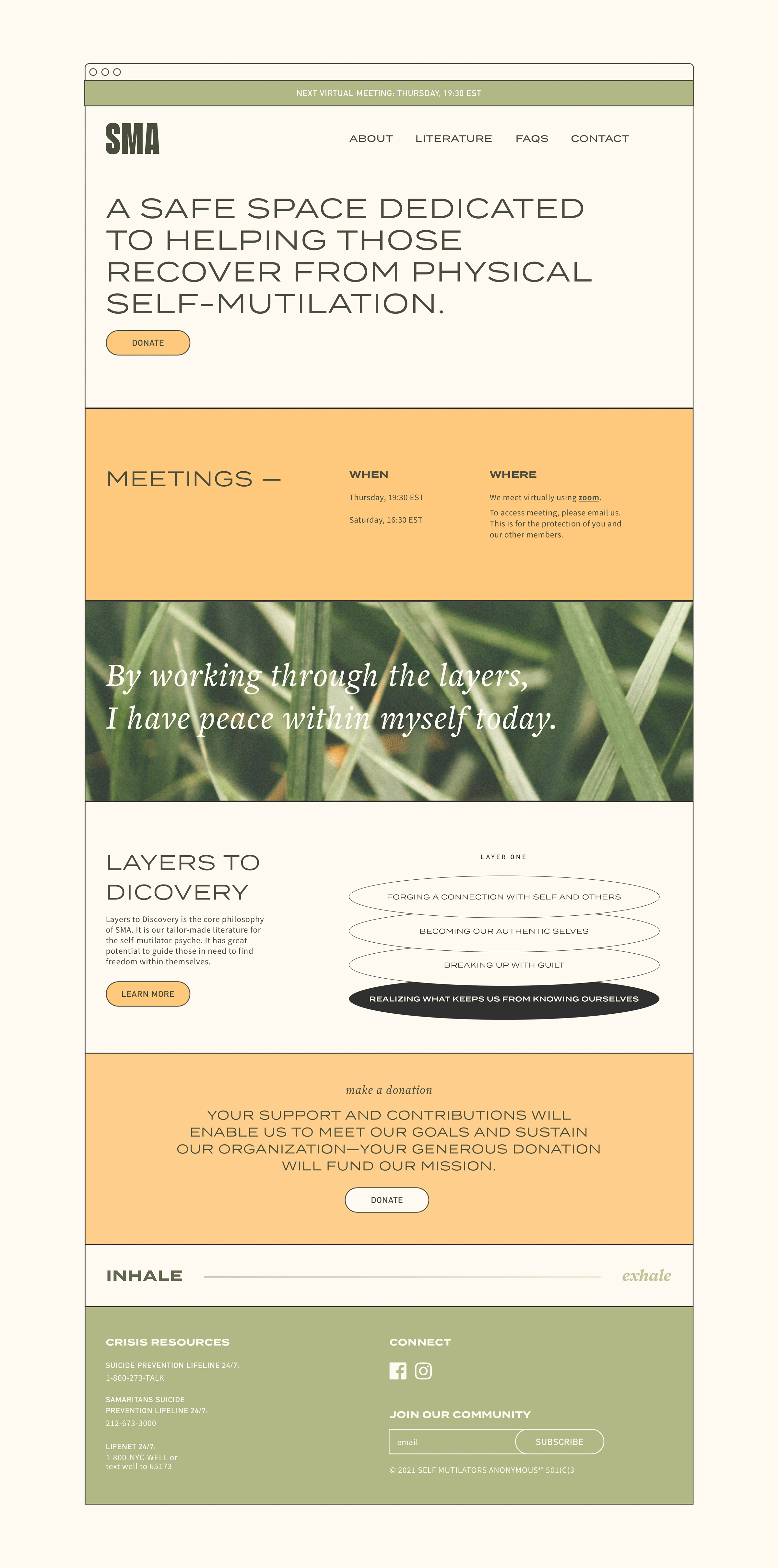
BRAND IDENTITY, WEB DESIGN, COPY, ILLUSTRATION, SOCIAL SELF-INJURY RECOVERY & AWARENESS IS A NON-PROFIT DEDICATED TO HELPING THOSE RECOVER FROM SELF-INJURY
CHALLENGESSIRA, founded in the '80s, held in-person meetings in NYC until Covid-19 necessitated a change in structure to online-only. Patrons new & old to the non-profit sought help & connection online. However, the organisation’s website served primarily as a virtual bulletin for in-person meetings & lacked comprehensive information. A website redesign became a pressing matter to better meet the needs of its community by housing more information online & creating a more robust online experience.
APPROACHThe guiding principles on the project were to foster a warm, supportive, and accessible space as those coming to the website were in search of healing.
With the onset of these world's changes, SIRA received more attention and inquiries than ever before. The need for online literature & resources became more critical than ever. To ensure the website catered to its vast audience— most were over 50, many lived outside the U.S.—large type, straightforward messaging, easily translatable live text, and simple, refined graphics were implemented.
Since SIRA grew as a grassroots organisation, it never developed its own full identity. However, images of the natural world were a through line in pamphlets and brochures, which inspired their continued use accompanied by bright cheerful colours.